Responsive Design Approaches for Educational Websites: Learning That Adapts
Chosen theme: Responsive Design Approaches for Educational Websites. Explore practical patterns, inspiring stories, and research-backed tactics to make learning platforms accessible, fast, and inviting on every screen. Enjoy the read, share your thoughts, and subscribe for future deep dives.
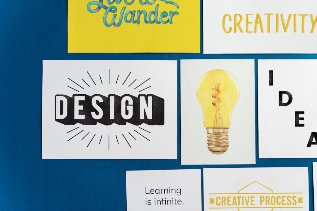
Principles that Shape Responsive Educational Experiences
Mobile-First Instructional Design
Start with the smallest screen and the most essential learning task. Prioritize clear goals, generous touch targets, and concise microlearning blocks. Then gracefully enhance for larger viewports with enrichment content, collaborative tools, and supportive visuals.
Adaptive Typography for Long-Form Learning
Readable type sustains attention during long study sessions. Use fluid type scales, comfortable line length, and variable fonts that adjust weight and width. Support dyslexia-friendly settings and user-controlled font size without breaking layout rhythm.
Accessibility-First Equals Responsiveness
True responsiveness respects diverse abilities and contexts. Apply semantic HTML, robust ARIA landmarks, and WCAG contrast ratios. Honor prefers-reduced-motion settings, ensure focus visibility, and design keyboard-only paths that parallel touch gestures and mouse interactions.
Navigation That Guides, Not Distracts
Reveal course details gradually to fit small screens without overwhelming students. Summaries expand on tap, prerequisite chips stack neatly, and filters collapse intelligently. This keeps exploration focused while still supporting deep dives when curiosity strikes.
Navigation That Guides, Not Distracts
Pin crucial actions—Submit, Save Draft, Ask Instructor—to a persistent but subtle bar. On mobile, anchor it within thumb reach. This pattern reduces scrolling friction during assignments and prevents accidental loss of work on unstable connections.
Media and Interaction that Scale Gracefully
Use aspect-ratio containers, adaptive streaming, and captions that reflow under video on small screens. Offer transcript toggles for low-bandwidth scenarios. Chapters and thumbnails should remain tappable, never microscopic, to support quick review before quizzes.
Media and Interaction that Scale Gracefully
Serve art-directed images for different breakpoints. Vector diagrams preserve precision, while responsive images balance clarity and speed. Add pinch-zoom support and long descriptions, ensuring complex visuals teach effectively without excluding assistive technology users.
Caching and Offline Possibilities for Lessons
Pre-cache lesson text, transcripts, and lightweight images so learning continues offline. Defer heavy assets until interaction. A gentle offline banner reassures students, while background sync safely submits drafts when connectivity returns.
Track where students hesitate or abandon. If critical explanations sit below the fold on mobile, elevate them. Heatmaps reveal crowded tap zones and guide spacing adjustments that reduce errors and frustration during assessments.
Data-Informed Iteration with Real Learners
Compare a concise, mobile-first onboarding flow against a dense, desktop-oriented version. Measure completion time, confidence ratings, and drop-off by device. Small layout shifts can meaningfully increase sign-ups and reduce first-week support tickets.
Case Story: A College Site That Finally Worked Everywhere
Before and After: A Breakpoint Reality Check
Initially, pages snapped awkwardly between tablet and desktop widths. We introduced fluid grids, recalibrated type scales, and restructured navigation. Overnight, help desk tickets about unreadable schedules on phones dropped by more than half.
Screen Reader Surprise that Changed Our Menu
User tests revealed hidden buttons announced out of order. We rebuilt the menu with semantic elements, visible focus, and ARIA-expanded states. Students using screen readers finished enrollment flows faster and reported greater confidence.
Measuring Outcomes Beyond Pageviews
The team tracked assignment submission rates on mobile, time to find advisor details, and bounce during registration. Results improved steadily, while survey comments mentioned clarity and calm. The redesign earned trust, not just traffic.